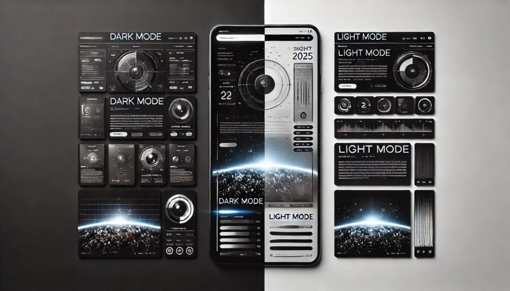
In the ever-evolving world of web design, one of the most debated trends is the choice between dark mode and light mode. Both have their unique aesthetics, benefits, and impact on user experience. But which one is best for your brand? Let’s explore the differences and help you make the right decision.
Understanding Dark Mode & Light Mode
Dark Mode: Features a dark background with light-colored text and UI elements. It offers a sleek, modern look that has gained popularity across apps and websites.
Light Mode: The traditional design with a white or light-colored background and dark text. It provides a clean and classic interface that has been the default for decades.
The Benefits of Dark Mode
✔ Eye Comfort – Reduces eye strain, especially in low-light environments.
✔ Battery Efficiency – Helps save battery life on OLED and AMOLED screens.
✔ Modern & Stylish – Gives a futuristic and premium feel to your website.
✔ Focus on Content – Reduces glare and makes visuals and media pop.
When to Use Dark Mode
- If your brand focuses on creativity, tech, or gaming (e.g., Spotify, Netflix, or gaming platforms).
- When you want a sophisticated and high-contrast look.
- If your audience frequently browses in low-light environments.
The Benefits of Light Mode
✔ Better Readability – Easier to read for long periods, especially with a lot of text. ✔ Traditional & Familiar – Most users are accustomed to light mode. ✔ Professional & Clean – Works well for corporate and informational websites. ✔ Improved Visibility in Bright Environments – Easier to use in well-lit spaces.
When to Use Light Mode
- If your brand revolves around professionalism, education, or e-commerce (e.g., banking, healthcare, or news sites).
- When text-heavy content is a priority for your audience.
- If your users primarily browse during the daytime.
Which One is Right for Your Brand?
The best choice depends on your brand’s identity, audience, and user experience goals. If you want to stand out with a sleek, modern design, dark mode might be the way to go. However, if your priority is clarity, familiarity, and professionalism, light mode could be the better choice.
Best of Both Worlds: Offering a Toggle Option
Many websites and apps now provide users with a dark/light mode switch. This ensures that users can choose the mode that suits their preferences, enhancing their browsing experience. Implementing a toggle option can increase user satisfaction and engagement.
Final Thoughts
Dark mode and light mode both have their strengths. Instead of seeing them as competing trends, consider how they align with your brand’s goals and user needs. Whether you choose one or offer both, the key is to prioritize usability, aesthetics, and accessibility.
What’s your preference—dark mode or light mode? Let us know in the comments!