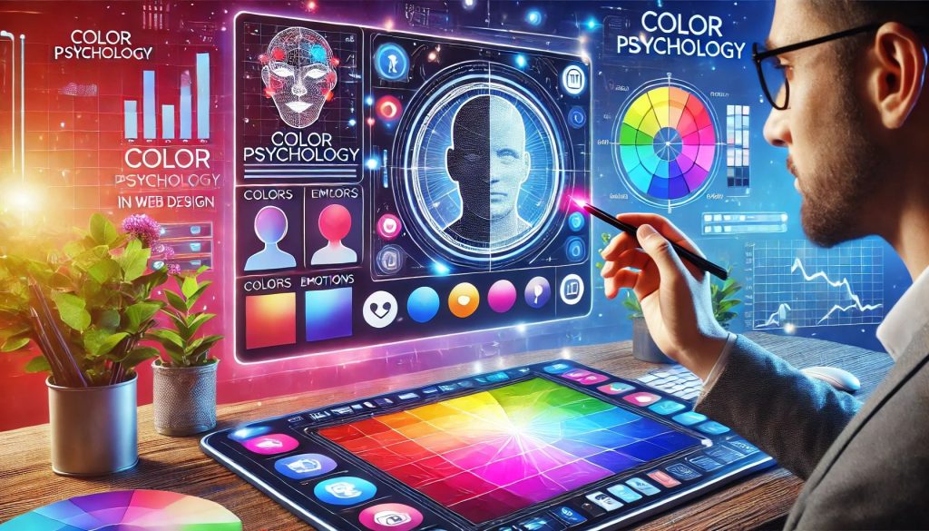
Color is more than just a visual element in web design—it plays a crucial role in shaping user perception, emotions, and actions. By understanding color psychology, you can create websites that engage visitors, build trust, and encourage conversions. Let’s explore how colors impact user behavior and how you can use them effectively in web design.
The Power of Colors in Web Design
Colors influence how users feel about a brand, product, or website. Different colors evoke different emotions, making it essential to choose a color palette that aligns with your brand’s message and goals.
How Different Colors Affect User Behavior
🔴 Red – Energy and Urgency
Red is bold, passionate, and attention-grabbing. It creates a sense of urgency, making it ideal for call-to-action buttons, sales promotions, and limited-time offers.
🔵 Blue – Trust and Professionalism
Blue conveys trust, reliability, and calmness. It is widely used by corporate brands, financial institutions, and healthcare websites to establish credibility.
🟢 Green – Growth and Balance
Green represents nature, harmony, and wealth. It’s commonly used in environmental, health, and finance-related websites to evoke positivity and trust.
🟠 Orange – Enthusiasm and Action
Orange combines the energy of red and the friendliness of yellow. It’s often used for call-to-action buttons and e-commerce websites to encourage engagement.
🟡 Yellow – Optimism and Attention
Yellow signifies happiness, creativity, and warmth. While it can attract attention, excessive use may cause eye strain, so it’s best used for highlights and accents.
⚫ Black – Luxury and Sophistication
Black exudes power, elegance, and sophistication. High-end brands use black in their web designs to create a sleek and modern aesthetic.
⚪ White – Simplicity and Clarity
White symbolizes cleanliness, simplicity, and minimalism. It helps create a clean and spacious design, improving readability and user experience.
Using Color Psychology in Web Design
✅ Align Colors with Brand Identity
Your brand colors should reflect your values and industry. For example, a financial website may use blue for trust, while an eco-friendly brand may opt for green.
✅ Create Contrast for Readability
Ensure text and background colors have enough contrast for better readability. A light background with dark text or vice versa improves user experience.
✅ Use Color to Guide User Actions
Colors should be strategically used to highlight important elements such as CTA buttons, links, and key information.
✅ Maintain Visual Consistency
Stick to a defined color palette throughout your website to establish a cohesive and professional look.
✅ Test and Optimize
A/B testing different color schemes can help determine which colors resonate best with your audience and drive engagement.
Final Thoughts
Color psychology plays a significant role in web design, influencing user emotions, perceptions, and decisions. By strategically using colors, you can create a visually appealing website that enhances user experience and boosts conversions. Choose your colors wisely and watch how they impact your audience’s behavior!
Would you like help in designing a website with the perfect color strategy? Feel free to reach out! 🚀